
LÉGION'ARTS




The Color We Miss
Foreword by Christian Morisot
When I like a piece of writing, I have the lazy heaviness to no longer want to express any criticism; only the overall impression and the joy of reading matter to me.
This text by our friend Antoine is full of color, and even if, in my new elsewhere, I find myself, without being on vacation, "the skin of some and others more coppery..." I must admit that looking at the "colors of time" in this way is particularly pleasant.
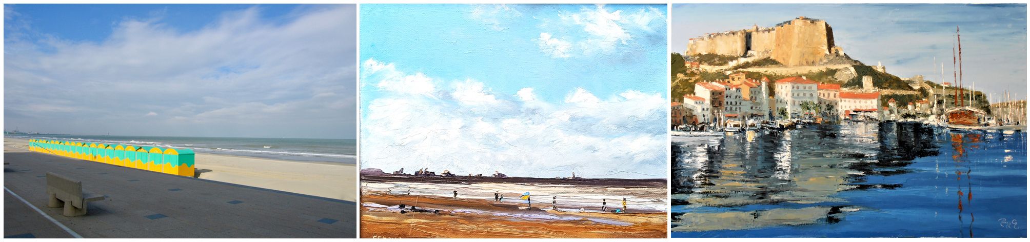
A digression is necessary in my mind: to imagine what the July vacationers on the beach at Malo-les-Bains in Dunkirk might be saying right now. I believe that for them, the color is almost definitively gray, to the point that the sea and the sky are one.
In a strange coincidence, just as I was reading this letter which stated, “no violent alarm could disturb their slumber,” my neighbor’s alarm started blaring loud enough to wake the entire neighborhood.
While it's true that perhaps a vacation is necessary to truly see, feel, and appreciate colors, I think that beachgoers, roasted like colonies of seals on sun-drenched beaches, must not see them the same way our friend did when he was immersed in the leafy canopies of Dire Dawa's streets, the aridity of Djibouti, or the verdant slopes of Switzerland…
It's also true that a landscape is merely a subjective perception of our photographer's eye, interpreting the frequencies of light. But, Antoine, your letter is comforting, thanks to the warmth of the imagined colors it offers us, making us dream to the point of "rediscovering a harmony dissolved in the worries of laborious days." This even applies to a retiree, so...
The Colors of Time
By Antoine Marquet
I don't believe that vacation time is simply a period of expansion, a time when the body rests, the mind finds peace, and a change of routine adds an exotic touch to every gesture. Vacation isn't just a rhythm that slows down or speeds up, but one that simply changes. It's not just the faces around you that no longer have the same features, or the skin of others that is more bronzed, or the women with the same allure. Nor are the sounds more subtle, the words different, the distant music more captivating, or the dreams more vivid because no violent alarm pulls them away from the shores of sleep. No.
Vacation is something else entirely. What, after all, makes us decide to rent a farmhouse in the Périgord region, or to relax in a ryokan*, or to join friends in Brazil rather than those in Argelès-sur-Mer?
Beyond the prospect of shared happiness, the hoped-for warmth in the south, the cool evenings under the northern birch trees or simply in the Savoyard mountains, beyond everything we think we know, there is "something" that governs these decisions. It is undoubtedly color. We don't imagine it, but we are drawn to a vacation spot by the barely conscious idea of a color that speaks to our souls, a color we have missed, a color we feel the need for.
I remember my first trip to Ethiopia when I was stationed in Djibouti. The leafy canopies over the streets of Dire Dawa, the profusion of flowers after the aridity of Djibouti, made me realize how much I was craving greenery and vegetation. I felt a very strong emotion. It was like an urgent need… The verdant slopes of this African Switzerland left a deep impression on me.
We need color. From Rothko's violent reds to Goya's dark browns, from ochres and the vibrant heat of the desert at dusk, when it becomes breathable, to the blue dawns. Almost a single color for the sand and the sky before the rising sun. From Mondrian's multicolored paintings to Klein's blues, to see only the maritime blue that invites coolness. The turquoise of Polynesian lagoons and the boat on the sea with, on the horizon, barely an island, a speck of green…
From the strange polychromy of Malevich to the blurred tones of Turner, from solid white to the delicate blue-grey of Icelandic glaciers, to the turbulent skies of Scotland. From the golden yellow of the Provençal plains, wet with patches of lavender, to the yellow of Portugal's beaches punctuated by the rocky ochre of its cliffs, or to the calmer yellow of the Croatian islands. Holidays are this encounter with the soothing power of the iris. A color that resonates with the soul. Something that allows us to rediscover a harmony dissolved in the worries of laborious days. A kind of chromotherapy. The ancient Greeks combined it with heliotherapy, blessed as they were not by their Olympian gods and their sun. They already knew that colors have vibrations colors, frequencies that suit some and displease others. In the very idea of our holiday departures, there's this dimension of healing, of an unexpected benefit thanks to the restorative color we choose. Blue delights the eye, but also calms the body and imposes a kind of peace. Yellow makes us smile, invites us to write…
Perhaps this is why, on holiday, we might want to do everything that seems impossible in other colors of time. To get away from it all, don't we say, to escape constraints? To the blue-green of Monet's water lily ponds? Against anxiety and weariness, to oppose the gentleness and infinite diversity of foliage. Blue, ochre, red associated with desire, with rediscovered youth. The calm of the night in the desert and the enthusiasm of wide-open spaces. Before choosing a holiday destination, we should consult a painter's palette, as the Pythia consulted animal entrails, and decide, dreaming of the hues and what they have to tell us if we simply lend an eye.
* ryokan = a type of Japanese inn.