



From the seven-flamed grenade to the Legion logo,
the journey of an unwitting designer
2/3
1981. A brigade, the sea, and a few deities
Back at Képi Blanc, where I've been a sergeant major for some time. A new unit has just been created, the 31st Brigade, a combined arms combat unit under the command of General Coullon, commander of the Foreign Legion. It is, in a way, the embryo of what will become the FAR.
Battalion Commander Chiaroni, head of the FELE, whose premises are next to the brigade's command post, asks me to design an insignia.
His initial idea is simple.
"It's a landing brigade, perhaps even an amphibious one. The sea should be featured, with Poseidon, Neptune, or something like that."
That's quite a change from the bridges and felines of Djibouti! We leave the railway tracks and head out to sea, with the Olympe as our support.
I prepare a design, which I present to him a few days later. The commander asks me to add two stars to represent the brigade, as well as the green and red colors of the Legion and the red and blue of the Marine Troops.
I incorporate these elements, taking care to maintain the overall balance. The Legion's colors appear first not out of basic chauvinism, but for graphic reasons; the red frames the central illustration and ensures the design's coherence.
The plans are handed in. Then… nothing. Radio silence!
I almost forget about it. In the military, a project can always disappear into the bureaucratic maze, end up in some strategic drawer, or patiently wait for another file to take precedence.
Several months later, to my surprise, I discover my insignia on the uniforms of the men of the 31st Brigade. There it is, faithful to the original design.
No ceremony, no fanfare, not even a word for the designer. But no matter, the insignia was adopted, and that's what counts.
In 1984, the 31st Brigade was replaced by the 6th Light Armored Division of the French Armed Forces. Units change, structures evolve, but a design can survive several reorganizations. In the army, that's quite an achievement!
1987. The day a calendar cover became the Legion's logo.
We now come to the most unexpected episode of this story.
After a stint at the CEFE (Foreign Legion Training Center) of the 3rd Foreign Infantry Regiment (3e REI) in French Guiana, followed by an assignment to the 4th Company of the 2nd Foreign Infantry Regiment (2e REI) in Nîmes, here I am back at the Legion, this time as deputy commander.
I have just left the ranks of non-commissioned officers for those of majors. At the time, the major was a separate corps. In the Legion, however, they don't always concern themselves with such subtleties; rank insignia may change, but the men remain the same.
At the end of 1987, I was working on the 1988 Legion calendar. Twelve pages had to be created, one for each regiment, plus Camerone and Christmas. Plenty to keep my pencils busy, even without launching an overseas operation!
All that remained was to design the cover.
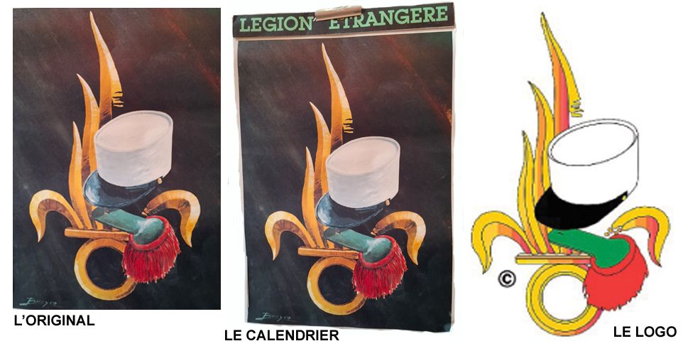
I sought to represent what characterizes the Legion and unites all its regiments. I proceeded by elimination, a tried-and-tested method that consists of removing what doesn't fit until very little remains… but only the essentials.
Five elements stood out: the white kepi, the green and red epaulette, the green tie, the blue sash, and the seven-flamed grenade.
I composed with these symbols, arranging and harmonizing them. The result seemed satisfactory to me, with one reservation: the tie and blue belt threw off the overall balance. I removed them.
And there it was! The cover was finished.
The calendar was published. The story could have ended there, and I probably would have gone about my business without imagining for a second that this illustration would have such a different destiny.
A few weeks later, my boss, Lieutenant Colonel Étienne-German, head of the Foreign Legion's Information and Historical Service (SIHLE), asked me to adapt the drawing into a logo for the COMLE (Foreign Legion Command).
He explained:
"It seems that the COMLE headquarters has been working on a logo for the Legion for some time, and this illustration perfectly matches their requirements."
So I took the drawing and adapted it into a line drawing.
That's how a calendar cover, designed to accompany an ordinary year, became the logo of the Foreign Legion.
Sometimes you have to look very far for great ideas. And sometimes, they're found right under a white kepi, between an epaulette and a grenade!
I didn't design this with the ambition of creating an emblem meant to last for years. I simply wanted to represent the Legion's shared identity with the elements I had at hand. The rest came about naturally, as decisions and circumstances unfolded.
The original drawing, on a dark background, is now kept at the Foreign Legion Museum in Aubagne. When I think it all started with a calendar cover, but I tell myself that you have to be wary of end-of-year projects. You never know where they might lead!
Share your writing
Elders of the Legion: about the Legion and other topics
Supporters: about the Legion